
I stood in the showroom last month staring at two slabs that both promised the bright, clean look every kitchen seems to chase. One was classic white quartz, pure and simple.
The other was Giotto, with its soft light grey background and those delicate branching veins. I needed to figure out which one actually worked better for real daily life, not just photos.
This article walks through the real differences in looks, performance, and how each one holds up so you can pick the right surface for your space.
| Feature | Giotto Quartz | White Quartz |
| Background Color | Soft light grey | Pure bright white |
| Pattern | Delicate branching white and dark grey veining | Solid or very subtle/minimal |
| Visual Feel | Quiet, elegant, marble-inspired | Clean, modern, airy |
| Dirt Visibility | Veining softens minor marks and crumbs | Spots, fingerprints, and crumbs stand out more |
| Best Style Fit | Transitional, classic, versatile | Minimalist, contemporary, bright spaces |
| Seam Matching | More planning needed for vein flow | Easier to match across pieces |
| Overall Brightness | Softens light slightly | Maximizes light reflection |
Key Differences Between Giotto Quartz And White Quartz
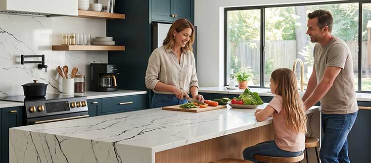
Background tone and light reflection differ more than people expect once the slabs leave the showroom lighting.
- Giotto’s soft grey base reduces the stark contrast that pure white creates against most cabinet colors.
- Vein structure on Giotto helps mask minor surface marks that pure white quartz highlights immediately.
- Seam placement and pattern flow require more attention with Giotto, while white quartz is more forgiving.
- White quartz maximizes perceived space in small or low-light rooms; Giotto creates a softer, more settled atmosphere.
- Both materials share the same non-porous structure, so stain resistance is essentially identical in practice.
- Long-term appearance depends more on how visible daily use becomes than on the material itself.
Key Features of Giotto Quartz And White Quartz Shared and Distinct
Both materials are engineered surfaces made primarily of natural quartz particles bound with resin. That construction gives them consistent hardness and a non-porous face that does not need sealing.
You can wipe spills without worrying about liquids soaking in the way they do with many natural stones.
Giotto’s distinctive features center on its quiet pattern language. The branching veins stay fine rather than heavy, so the surface does not compete with other elements in the room.
Thickness options typically match standard quartz slabs, and the finish is usually polished, which highlights the soft contrast between the grey background and the lighter veins.
White quartz features focus on clarity and consistency. Many pure white options have almost no visible movement, which makes color matching across multiple slabs straightforward.
Some versions include a light sparkle or very faint clouding, but the overall effect remains bright and uniform. Both surfaces resist everyday scratches better than softer natural stones, though neither is completely immune to damage from sharp impacts or extreme heat.
Also Read: Comparison of Perla Venata And Taj Mahal Quartzite.
Pros of Giotto Quartz
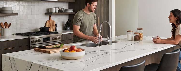
- The soft light grey background with delicate branching veins creates an elegant look that feels more refined than solid white without becoming busy.
- Minor marks, water spots, and crumbs are less obvious because the pattern breaks up the visual field.
- It pairs comfortably with a wider range of cabinet colors and finishes, including warm woods and soft greys.
- The quiet aesthetic works well in both transitional and classic kitchens without locking you into one strong style.
- Everyday cleaning feels less stressful because small imperfections do not stand out as quickly.
- The marble-inspired movement adds character to islands and long runs without requiring the maintenance of actual marble.
- In rooms with strong natural light, the surface avoids the overly bright or sterile appearance that pure white can produce.
- Resale appeal stays strong because the look is versatile rather than trend-specific.
I have seen Giotto installed in kitchens where the homeowners cook frequently. The counters still looked composed after months of regular use, mainly because the veining continued to hide the small signs of daily activity. That practical forgiveness is one of the clearest advantages when you live with the surface rather than just looking at samples.
Cons of Giotto Quartz
- Vein flow needs careful planning during fabrication so seams and cutouts do not interrupt the pattern awkwardly.
- Some people prefer a completely uniform surface and find even subtle veining distracting over time.
- Availability can be more limited than basic white quartz options depending on the supplier and region.
- The soft grey background means the surface does not brighten a dark room as effectively as pure white.
- Matching multiple slabs for a large project requires more attention to keep the overall look consistent.
- If your design relies on maximum light reflection, the grey base works against that goal.
- Pattern variation between batches exists, so the exact vein placement on your final slabs may differ slightly from the sample.
These limitations matter most when the kitchen layout is complex or when the primary goal is pure brightness. In simpler layouts with good lighting, the cons become less noticeable.
Pros of White Quartz

- Pure bright white maximizes light reflection and makes smaller or darker kitchens feel larger and more open.
- The uniform appearance simplifies seam placement and reduces the need for careful pattern matching.
- It creates strong contrast with dark cabinets, black hardware, or colorful backsplashes.
- Cleaning looks more dramatic because the surface returns to a crisp white after wiping.
- Availability is typically broad, with many suppliers offering consistent pure white options.
- The minimalist look supports contemporary and modern design directions without visual competition.
- White quartz photographs well and often presents a polished, finished appearance even before accessories are added.
- Cost can be lower than more patterned or specialty slabs in many markets.
In a kitchen I recently reviewed with limited window space, the pure white counters made the room feel noticeably brighter than the veined alternative. That practical lighting benefit is hard to ignore when natural light is scarce.
Cons of White Quartz
- Crumbs, fingerprints, water spots, and colored spills become more visible against the solid bright background.
- The surface can appear stark or clinical under strong lighting or next to very light cabinets.
- Some homeowners find the look too plain after living with it for several months.
- Strong pigments from foods or cleaning products can leave temporary marks that require prompt attention.
- The high brightness can highlight any imperfections in the surrounding cabinetry or installation.
- In busy households, the counters often look less tidy between cleanings compared with patterned surfaces.
- Yellowing or color shift can occur over many years with prolonged direct sunlight, though this is less common indoors.
These downsides are most apparent in high-use kitchens where food preparation happens daily. The surface itself does not stain more easily, but the visual evidence of use is harder to ignore.
Also Read: Comparison of Naica Quartzite And Taj Mahal.
What Makes Giotto Quartz Different in Real Kitchens?
Giotto stands out because it does not try to be stark or dramatic. The soft light grey background carries fine, branching white and dark grey veins that feel quiet rather than bold.
When I looked at a full slab in person, the movement stayed subtle even across a large island. That restraint is what many people like about it once the counter is installed and the rest of the kitchen comes into view.
You notice the difference most in natural light. White quartz can bounce so much light that a room feels almost clinical under bright windows. Giotto softens that effect without turning the surface dark.
The veins add just enough texture so the counter does not read as a flat plane. In my own comparison samples, coffee rings and water spots were harder to spot at a glance on Giotto because the pattern broke up the solid field.
It also works across more cabinet colors than a pure white slab. Light oak, soft greys, and even muted greens sit comfortably next to it. Pure white quartz often demands stronger contrast or very carefully matched white cabinets, or the whole kitchen can feel washed out.
How White Quartz Performs in Everyday Use?
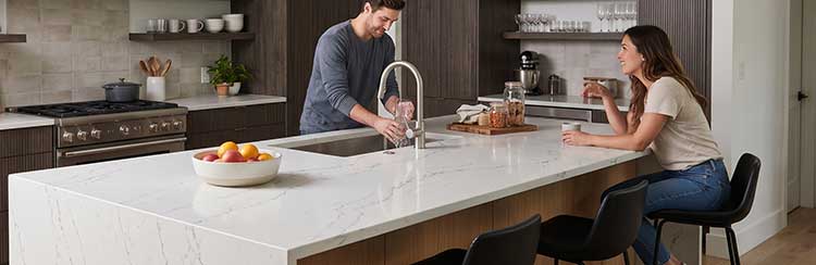
White quartz delivers the clean, bright surface that photographs well and makes smaller kitchens feel larger.
When I set a pure white sample next to a Giotto piece under the same lighting, the white version made the surrounding walls look brighter by comparison. That reflection is useful if your space has limited windows or dark cabinets.
The trade-off shows up the moment real life starts. A single blueberry, a smear of oil, or fingerprints around the faucet area become more noticeable.
I tested both samples by leaving a damp cloth and a few crumbs overnight. The white surface made the crumbs look larger. Giotto’s veining absorbed the visual noise.
White quartz also simplifies layout decisions. Seams are easier to place because there is little pattern to interrupt. Fabricators often prefer it for complicated islands or rooms with many cutouts because matching is straightforward. With Giotto you spend more time choosing where the veins run across a sink cutout or a seam.
Also Read: Comparison of Soapstone And Quartz Countertops.
Which Surface Fits Different Kitchen Styles?
If your cabinets are light oak or soft grey and you want the counters to sit quietly in the background, Giotto usually integrates more naturally. The soft grey base prevents the clash that can happen when pure white meets warm wood tones.
In contemporary kitchens with flat-panel white or light grey cabinets, pure white quartz often creates a seamless, gallery-like effect that many people prefer.
Island design also influences the choice. A large island with a waterfall edge benefits from Giotto’s movement because the veins continue down the vertical face and add interest without needing additional materials.
Pure white quartz on the same island can look clean but may feel flat unless you introduce contrast through the base or the backsplash.
Lighting conditions matter more than most sample comparisons reveal. In a north-facing kitchen with cooler light, white quartz can feel cold. Giotto’s soft grey background often reads warmer under the same conditions.
South-facing rooms with strong sun can make pure white feel bright and energetic, while Giotto stays composed.
Maintenance and Daily Reality
Both surfaces clean the same way. Mild soap and water or a non-abrasive cleaner removes most spills. Neither requires sealing. The difference appears in how often the surface looks clean between those cleanings.
On pure white quartz I find myself wiping more frequently simply because small marks are obvious. With Giotto the same marks blend into the pattern longer, so the counter stays presentable with less constant attention.
Heat is a shared limitation. Both materials can be damaged by hot pans placed directly on the surface. Trivets remain necessary regardless of color or pattern. Sharp impacts can chip edges on either material, though the non-porous structure means liquids do not penetrate if a chip does occur.
Over time the practical difference settles into habit. Households that cook and clean as they go often prefer white quartz because the bright surface makes the kitchen feel reset after each wipe-down.
Households that want the counters to look composed even when life is busy tend to favor the visual forgiveness of Giotto.
Cost and Long-Term Value
Pricing varies by region and supplier, but pure white quartz is frequently available at a lower price point than more specialized patterned options.
Giotto typically sits in a mid-range category because of its specific veining. The cost difference is usually not extreme once installation is included, yet it can influence the decision on larger projects.
Resale considerations favor both materials because quartz remains popular. The versatile appearance of Giotto may appeal to a broader range of future buyers who do not want a stark white kitchen.
Pure white quartz appeals strongly to buyers seeking maximum brightness and a modern look. Neither choice is likely to hurt resale if the rest of the kitchen is well executed.
My Assessment After Living With the Comparison
After comparing both materials in real lighting and under normal kitchen conditions, I lean toward Giotto for most households that cook regularly. The soft pattern reduces the visual maintenance burden without sacrificing the clean appearance people want from quartz.
Pure white quartz still wins when the primary goal is maximum brightness or when the design is strictly minimalist and the household does not mind more frequent wiping.
You will notice the difference most clearly after the first month of real use. Sample slabs under showroom lights do not reveal how either surface looks at 7 a.m. with breakfast crumbs still on the counter.
Giotto usually looks more composed in those moments. White quartz looks brighter when everything is freshly cleaned.
Also Read: Comparison of LG Minuet And Rococo Viatera Quartz.
Frequently Asked Questions (FAQ)
Giotto quartz has a soft light grey background with delicate, fine branching white and dark grey veining.
Popular options often include Calacatta-style white with grey or gold veining, pure white, soft Carrara-inspired patterns, light grey with subtle movement, and warm cream or greige tones with light veining.
They show crumbs, fingerprints, and colored spills more clearly than patterned surfaces, can look stark under strong light, and may require more frequent wiping to stay looking tidy.
White and off-white remain the most popular category, especially versions with soft marble-inspired veining.
Wrapping Up
I have spent enough time with both surfaces to see how the choice affects daily life rather than just the initial impression. Giotto’s soft light grey background and delicate veining give you an elegant look that stays practical once the kitchen is in use.
White quartz delivers unmatched brightness and simplicity when that is the priority. You should base your decision on how much visual forgiveness you want between cleanings and how the surface will interact with your specific lighting and cabinets.
Either option can work well, but the one that matches your actual habits will feel better every day.